By Louise Touchette
Every time you step into your home, the colors surrounding you make a powerful impression. In a city like Boston—where old-world elegance meets innovative energy—the shades you choose don’t just fill the walls; they influence your entire experience at home.
Whether you’re seeking a sense of calm after a long commute, hoping to spark creativity for your next project, or simply want a welcoming space for guests, color psychology can help you create an environment that fits your lifestyle and mood.
Boston’s dynamic seasons, classic architecture, and lively neighborhoods all play a role in how color shapes your space. Imagine a cozy retreat to recharge during a snowy winter or a bright, uplifting sanctuary to enjoy the sunny days.
If you’ve ever wondered why certain rooms just feel right or want to tap into the science behind beautiful interiors, you’re in the right place. Discover how color psychology can unlock your space’s full potential and help you enjoy every moment in your Boston home.
Key Takeaways
- Understanding color psychology gives you more control over how your home feels day to day.
- Boston’s unique light, architecture, and seasons affect how different colors show up in your space.
- Each color leads to distinct emotions, so you can craft rooms that energize, relax, or inspire.
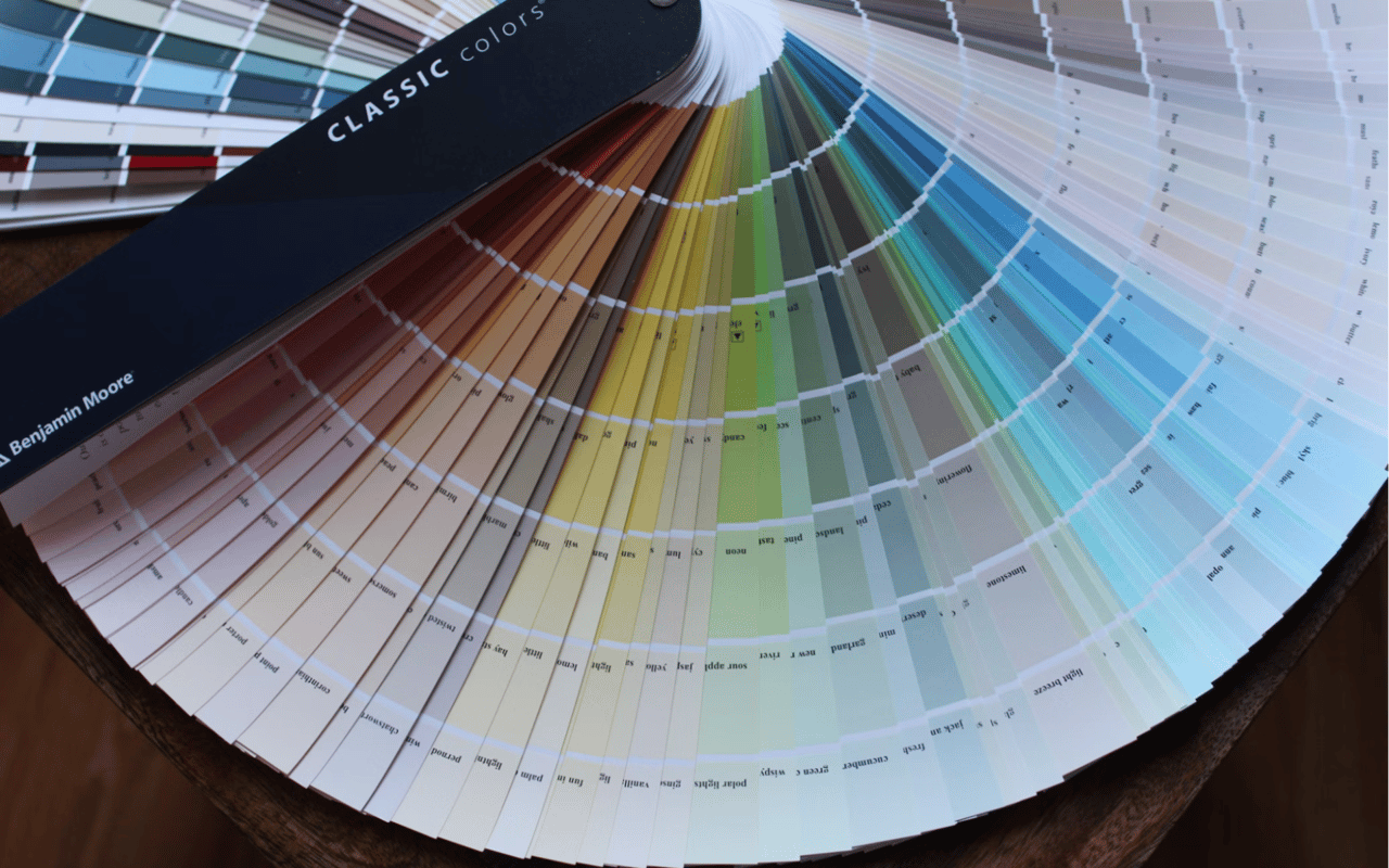
The Basics of Color Psychology
Think of color psychology as your secret design tool—one that can subtly shift the mood in your home without a complete makeover. At its core, color psychology is about the science of how color impacts emotions and behavior.
Warm colors, like red, orange, and yellow, instantly energize a space and make it feel more inviting. Cool shades—blue, green, and violet—naturally create a calming, restorative environment. Neutral tones offer flexibility and understated style, working with everything from traditional brick brownstones to sleek, modern condos.
By understanding how color works on a psychological level, you can use it to your advantage. Want to make your living room buzz with social energy? Hoping for a peaceful bedroom that helps you drift off? Every choice you make, from wall color to throw pillows, shapes your home’s atmosphere.
Why Color Psychology Makes a Real Impact
- Color isn’t just about style—it actively changes how you feel and function in your home.
- Strategic color choices can help you recharge, focus, or feel inspired every day.
Choosing Colors for Boston’s Ever-Changing Light and Seasons
Boston’s climate is known for its dramatic shifts: bright summer afternoons, crisp autumns, and long stretches of moody winter. The quality of light in your home changes with the season and the time of day, affecting how any color appears on your walls.
North-facing rooms tend to feel cooler and need a touch of warmth to feel inviting, while south-facing spaces soak up the sunlight, which can make cool shades seem softer and more balanced. East-facing rooms catch the morning light, whereas west-facing rooms glow in the late afternoon. If you want your space to look and feel its best year-round, let Boston’s unique natural light guide your choices.
When winter sets in and daylight is limited, vibrant or warm tones can uplift your spirits. During the sunnier months, lighter hues keep your space feeling open and airy. Testing samples on multiple walls and at different times of day helps you find the color that truly fits your home’s vibe.
Tips for Navigating Light
- Always test paint samples in your space before making a decision.
- Use warm tones to cozy up dark, chilly rooms.
- Embrace lighter, reflective shades to make the most of smaller spaces.
- Pair bold hues with understated neutrals for a look that feels balanced, not overwhelming.
Using Warm Colors to Energize and Welcome
Warm colors have an unmistakable way of making you feel more connected to your space. The right shades of red, orange, or yellow can transform a room from stark to vibrant in an instant.
Red radiates energy and brings people together—making it a standout choice for social spaces like living rooms or dining areas. Orange sparks enthusiasm and creativity, perfect for a kitchen or home office. Yellow adds a dose of happiness, which can be especially uplifting in entryways or breakfast nooks.
You don’t have to paint every wall to benefit from warm tones. Even a few carefully chosen accents—a colorful rug, vivid throw pillows, or an art piece—can create warmth and personality. The secret is knowing where to add pops of color without tipping the balance.
Warm Color Strategies
- Add vibrant red or orange pillows and throws for instant energy.
- Use golden yellow as a cheerful accent in kitchens or hallways.
- Hang bold, warm-toned artwork to enliven a neutral room.
- Bring in metallic elements like brass or copper for subtle warmth and sophistication.
Embracing Cool Colors for Calm, Focus, and Renewal
When you need a space that helps you unwind or focus, cool colors are your best bet. These shades evoke feelings of peace and clarity—something everyone can appreciate after a busy day in the city.
Blue, in all its forms, is a top pick for creating a serene oasis. Soft sky blues make bedrooms and reading nooks feel tranquil, while deep navy brings drama and sophistication. Green is all about renewal and growth—ideal for living rooms or home offices where you want to recharge. Violet, with its creative and contemplative energy, works well in small doses for art studios or a statement wall.
For Boston homes that can sometimes feel compact, cool colors help open up the space, giving your rooms a fresh, expansive feel. The trick is layering in cozy textures so that your cool palette never feels chilly.
Cool Color Inspiration for Your Boston Home
- Choose light blue bedding and walls for a dreamy, restful bedroom.
- Opt for sage or eucalyptus green in the living room to foster relaxation.
- Try a splash of lavender or muted violet in creative spaces.
- Accessorize with ocean-inspired pieces to bring the tranquility of the coast indoors.
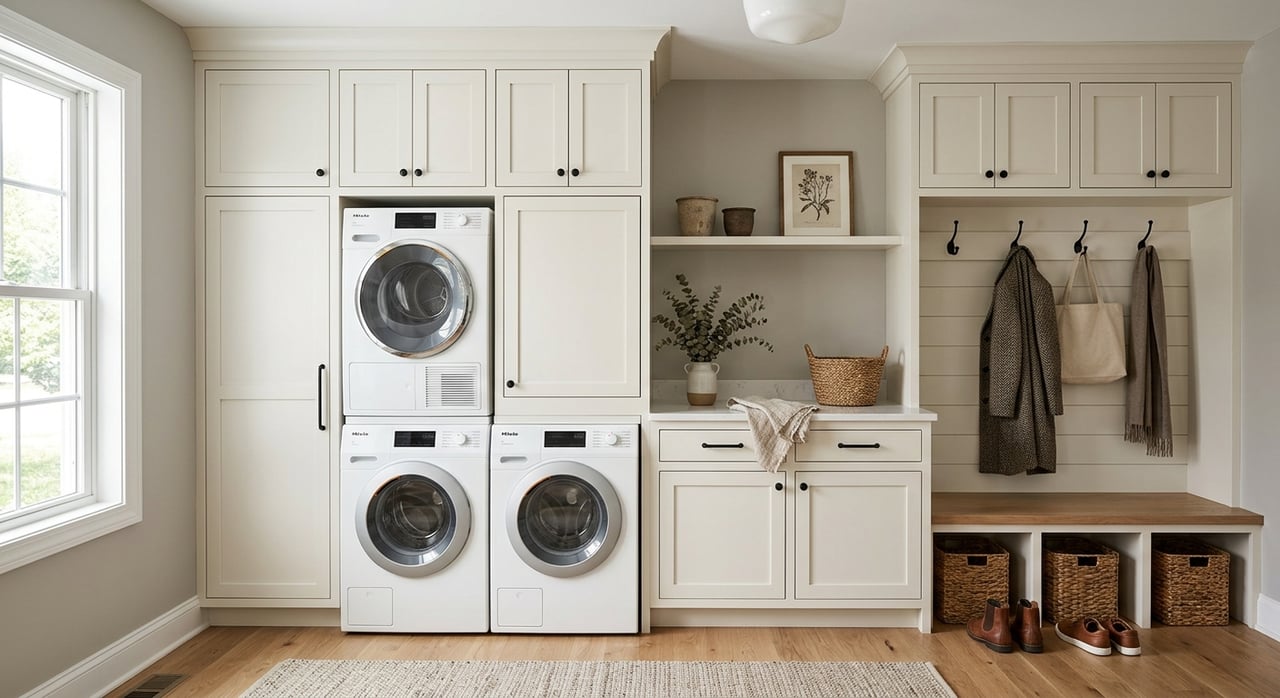
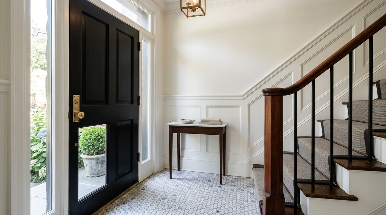
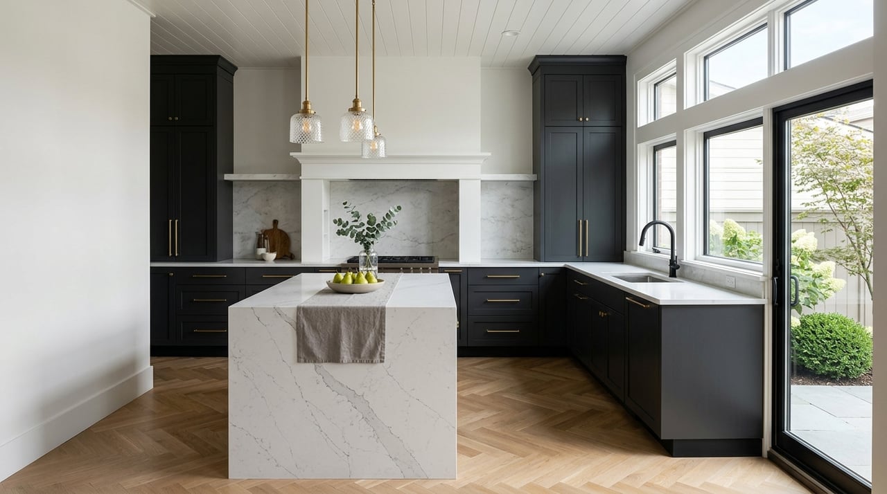
The Enduring Appeal of Neutral Shades
Neutrals are the backbone of many interiors for good reason: they create a calm, sophisticated foundation that works with any style. White, beige, taupe, and gray let the architectural details shine, whether you’re working with original crown moldings or modern minimalist lines.
Neutral palettes are especially practical in Boston, where homes feature beautiful woodwork, exposed brick, or unique floor plans. By keeping your main colors understated, you have the freedom to highlight art, books, or standout furniture.
To keep things interesting, layer different materials and shades; think soft linens, nubby wool rugs, sleek ceramics, and matte paint finishes. Even in a neutral space, you can introduce bursts of color through seasonal accessories, switching things up as your mood or the weather changes.
Making Neutrals Work
- Consider greige walls for an upscale, adaptable look.
- Use crisp white or soft cream to highlight architectural details.
- Layer textures and materials to prevent a neutral room from feeling bland.
- Ground your palette with touches of black or charcoal for added depth.
Creating a Cohesive Color Scheme
If you want your home to feel harmonious and thoughtfully designed, a cohesive color palette is key. This doesn’t mean every room should look the same; rather, repeating colors and tones in different ways ties your space together and creates a sense of effortless flow.
Pick two or three main shades and use them as your foundation. You can then layer in lighter or darker versions or introduce complementary accent colors. Simple details, like matching trim or using a consistent color for doors, can help unify your space. Rugs, curtains, and art that echo your chosen palette further enhance the sense of connection.
Tips for a Seamless Color Flow
- Choose a primary palette and echo it throughout your home for unity.
- Add depth with varying shades, patterns, and materials.
- Use rugs and window treatments to transition between spaces.
FAQs
What Are the Best Colors for Compact Spaces?
Light, airy shades like pale gray, creamy white, or soft blue make small spaces feel open and inviting. Reflective surfaces and carefully placed mirrors also help maximize brightness and space. Add personality with smaller, colorful accents.
How Can I Make My Living Room Feel Cozier During Boston’s Winters?
Embrace warm hues like golden yellow, rust, or deep orange for a comforting effect. Layer in plush textiles and use soft lighting to create an inviting retreat from the cold.
Which Paint Colors Complement Exposed Brick?
Shades like taupe, warm gray, or soft white let the brick’s natural texture stand out. For added contrast, consider deep green or navy, which bring a modern edge to classic features.
Let Color Transform Your Boston Living Space
Your home should energize, comfort, and inspire you—and color is one of the most powerful ways to make that happen. In Boston, every space is an opportunity to reflect your style and support your well-being, whether you’re surrounded by historic architecture or starting fresh in a modern space. Boston is a city where tradition meets creativity, so let your living space celebrate that same spirit.
If you’re ready to create a living space that truly reflects your goals, style, and daily needs, personalized guidance can make all the difference. Reach out to me, Louise Touchette, today. Whether you’re searching for your perfect home in Boston, planning your next move, or looking for trusted advice, I’m here to help every step of the way.